Monday, 27 September 2010
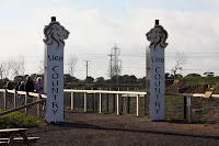
Existing signs
These two signs below are a good example of how they are using type and image on their signs but I want to combine the two and create a typeface with an animal theme. Using silhouettes like they already do is a good way of not letting the detail of the image take over the type.
As well as applying my chosen typeface to the signs, I also want to re-design the map and apply it to that too. I do like the signs as they are now, and they all have a running theme through them, but I think it's a place that has the opportunity for me to use my illustrative type designs over a range of materials and scales to give my designs a purpose.
Subscribe to:
Post Comments (Atom)


No comments:
Post a Comment