I took these photographs to be able to use for my own work to demonstrate how my book cover designs and posters can work in their real context.
Monday 22 November 2010
Tuesday 16 November 2010
Wonderland
I still haven't decided whether or not the typefaces will be a combination of an existing font with illustrative animal details added on, or a completely hand drawn typeface. If I decide on the latter, I really like this colourful, simple style that is shown here on the Wonderland font, hand drawn with felt tip pen by Eve Duhamel.
Saturday 13 November 2010
Menosunocerouno
Menosunocerouno is a Mexican design agency that often works on restaurant branding, and these examples are from different projects, but I really like the running black and white style throughout. Time to get designing!
Red Stripe
Red Stripe is an American Brasserie menu design by fresh oil. I was drawn to this because of its black and white design, but in looking more closely, I hope my layout isn't as busy as this, as I think white space is a necessity, as a customer doesn't want to be overpowered by a block of text.
Thursday 11 November 2010
Korn Design
These may be identity designs applied to stationery, not menu designs, but I am really drawn to the simplicity of the layout, colours and shapes. I particularly like the use of narrow fonts, like The London Hotels design below, which is bold but takes up less space on the page, giving a spacious, clinical feel to the overall design. I am really inspired by this type idea and black and white theme for my own menu designs.
Ben Whitla's design for Champalimaud's identity below is another example of simlicity throughout a design that really works.
Ben Whitla's design for Champalimaud's identity below is another example of simlicity throughout a design that really works.
Saturday 6 November 2010
Alvin Diec
This Cakes and Ale restaurant menu by Alvin Diec, a graphic designer from atlanta, is another example of how difficult yet possible it is to work out a layout suitable for a menu design. There is a lot of text on a menu and they are often designed so that the list is centred or left justified like below to fit everything on. Yet Diec has managed to make it look subtle and not too text heavy by leaving white space where possible and creating a cover design with a light tint of black so that it sits back on the page.
Friday 5 November 2010
Morrissey
Here is a simple, classy identity design for Milano restaurant by William Morrissey. I definitely think with a four star hotel, the simpler the better so this is a good example of the professional finish I want it to have. Even though I aren't designing the identity logo for the hotels, I still have the individual restaurants to design in a subtle, sophisticated style like this.
Nothing Something
I'd really like to keep a simple black and white theme throughout my menu designs, with perhaps a small introduction of colour to separate the hotel sets. This being said, I really like this design by Nothing Something for Magnolia Gastropub & Brewery, although it is quite busy with a lot going on. Separate attachments for daily menus might be a good idea like they have used below.
Thursday 4 November 2010
Promotional research
Book stores, such as Waterstones always have large scale posters advertising their offers, new stock, latest best sellers, etc. so I want to design posters suitable for this environment.
Here is a typical layout for book promotion, with bold limited text and a large image, that I will base my designs around.
Here is a typical layout for book promotion, with bold limited text and a large image, that I will base my designs around.
Tuesday 2 November 2010
Carson Ellis
The rake's-song in graphite - album art by Carson Ellis
This gave me the idea of creating type out of twigs, something which I have experimented with before so may try again.
This gave me the idea of creating type out of twigs, something which I have experimented with before so may try again.
Monday 1 November 2010
Julian
Nathaniel Cooper collaborated with Jordan Gray and Brent Anderson to design this menu for Julian restaurant. Again it is type driven, with no distracting imagery or fancy patterns.White space and neat layout is the key theme I want to focus on, like the example below.
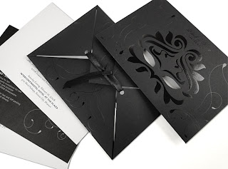
This Black & White Masked Ball Invitation for the Shakespeare Festival below is also by Nathaniel Cooper. I'd like to combine this spot varnish finish for a cover design with the simple Julian design above to hopefully create a minimal, sleek menu design.
This Black & White Masked Ball Invitation for the Shakespeare Festival below is also by Nathaniel Cooper. I'd like to combine this spot varnish finish for a cover design with the simple Julian design above to hopefully create a minimal, sleek menu design.
Nathaniel Cooper
This is a nice, clean cut menu layout that suitably fits in with the theme of the restaurant - something that is important to consider when I design the hotel menus.
Subscribe to:
Posts (Atom)


