Motion graphics title sequences chosen for their use of colour, clever icons and professional timing.
Casino Royale - an obvious choice to look at but I always hoped that someday this title sequence would pop up in my work, because I remember thinking it was one of the most memorable bits of the film! I just love how everything links so smoothly together and I know I couldn't produce something of that standard at this stage but I hope to take aspects of it into my work, such as clever use of shapes, silhouettes and strong colours, that all make adding live video shots irrelevant and unnecessary.
Three others that stick in my mind are the title sequences from Monsters Inc. which I couldn't resist putting on, the very clever Catch Me If You Can that outlines the title and plot in a very gripping, silhouetted chase linking in each frame subtly, and Spiderman's opening sequence that simply involves a 3D view of type and spider-web.
Tuesday 29 December 2009
Wednesday 23 December 2009
Christmas TV idents
Whilst I am trying to come up with a film genre that I want to use for my idents, I saw some festive idents that caught my eye so had to put them on here.
bbc2
bbc
bbc2
bbc
Monday 21 December 2009
Film4 season idents
For this brief I need to portray a genre of films, similar to how film4 works their audience, enticing them to watch what's coming up. However, this is going to be done with motion graphics and without the use of video to work with so I need to think about other aspects e.g. colour, tone of voice, typefaces, timing and even music to promote a season of films.
I could even create my film genre idents for a specific, existing channel to give them some grounding and branding. I came across an interesting sequence of itv2 idents and thought this could be an appropriate channel to work with. However, I couldn't upload the videos, so I have just left links for now.
sport theme, music theme, itv2 movies
Sunday 6 December 2009
Thursday 3 December 2009
Design for Screen
Initial typography motion graphics research for inspiration.
Technologic
http://www.youtube.com/watch?v=mZzs5Lz6uY8
http://www.youtube.com/watch?v=ZaXczKT21Bg
V for Vendetta
http://www.youtube.com/watch?v=c6Q0dfrbr10
Tick Tick Boom
http://www.youtube.com/watch?v=5oKH8iiGVzQ&NR=1&feature=fvwp
BBC2 indents
http://www.youtube.com/watch?v=0hrcYvOy2tE
Idiocracy Kinetic Typography
http://www.youtube.com/watch?v=xZ74P0dPsXI
Friday 20 November 2009
Found inspiration
Luckily I found these various CD packages around the house after I had decided I wanted to design the packaging for one myself. It really helped to see various ways it could be done for real, instead of just on-screen or in books.
Kanye West fold-out album


Classic sleeve

Book cover theme

Simple sleeve with circular cut-out front


This is the original CD case where my idea for the final resolution came from.


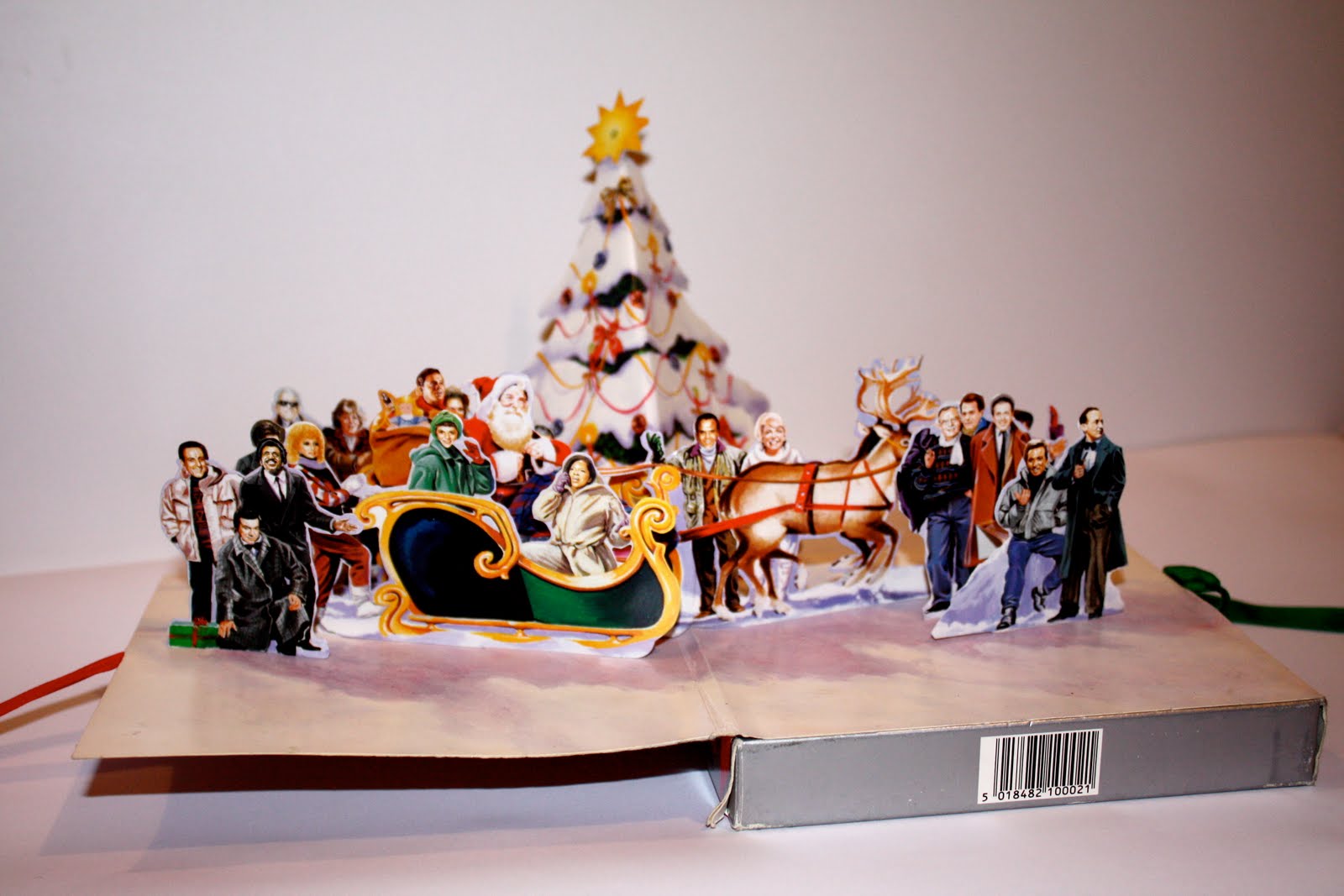
Amazing pop up christmas design!


Kanye West fold-out album


Classic sleeve

Book cover theme

Simple sleeve with circular cut-out front


This is the original CD case where my idea for the final resolution came from.


Amazing pop up christmas design!

Sunday 15 November 2009
More relaxation & health packaging
This is some of my competition for my packaging, in the form of yoga and meditation CDs, health drinks, creams, perfumes etc all supposed to relax the mind, body and soul.


Why I need a good design!!
The promotion of Laughter in the CD form being a way to stay healthy and fit is lacking to say the least. Bad designs on existing CD's have really made me want to excel in my designing, to produce a simple, eye-catching, persuasive CD package to get across the message and importance of laughter being good for your health.
Here are some existing Laughter CD's:

This CD is the one that I did in fact send off for and am re-designing their packaging to promote its 60 minutes of continuous laughter content as a way of staying healthy.


Here are some existing Laughter CD's:

This CD is the one that I did in fact send off for and am re-designing their packaging to promote its 60 minutes of continuous laughter content as a way of staying healthy.


Thursday 12 November 2009
My favourite CD Design
Deftones CD cover

I absolutely love the typeface and layout of this cover. It definitely gives me plenty to think about for my designs. It grabs your attention, is loud, but not overpowering. The rounded typeface softens the edges and makes it read less harsh and I especially like the text being too big to fit on the cover so it wraps around the sides.
I absolutely love the typeface and layout of this cover. It definitely gives me plenty to think about for my designs. It grabs your attention, is loud, but not overpowering. The rounded typeface softens the edges and makes it read less harsh and I especially like the text being too big to fit on the cover so it wraps around the sides.
Magazine layouts
Every single one of these really excite me and it has made me realise just how much I want to venture into the typographic, editorial and layout side to graphic design. These are all going to be used as inspiration when designing my 16 page Design for Print booklet. Simple grids and clean cut but creative layouts are what I want to develop:


Modern Design magazine (2008, issue 13)


Dwell magazine
Official US Playstation magazine

Modern Design magazine

Life Lounge magazine

Keeping on track

Breaking new ground magazine

CD Typography designs


Subscribe to:
Posts (Atom)