Thursday 28 October 2010

Smicker Dubblera

Another example of how colour can make all the difference and completely alter the way you look at a design.

'On its own the typo­graphic sys­tem is super sim­ple, but the pop of pink paper really makes it sing.' (DesignWorkLife)


Children's animal alphabet

I don't want my typeface to be too illustrative, but I couldn't resist putting these up that I found from a Vector stock illustrations website; pictures-vector.com

I think if I was aiming it at young children and creating type for a zoo this would work, but maybe not the wildlife park as it doesn't have a vast amount of wild animals that you could associate the letters with, such as e for elephant and m for monkey.


Print decisions

I'm still at the early development stage of this brief, but I really want to give the menu design a professional and expensive finish, and high end print processes are something I do not know a lot about and need to research into further. Suggestions at the last crit were to use spot varnish, embossing or foil blocking, none of which I have done before but I want to know how. Here are some examples of how I want my designs to end up looking like using these techniques.

Found on frankel.co.uk; a printer's in London that show these as examples:


Wednesday 27 October 2010

Campo Colour Examples

A Brazilian graphic design company, Campo, produce some interesting printed designs for many companies. Here are some identities which show ways in which I could add colour to my make up artist identity designs and stationery in different ways.

Identity for Vermelho, the São Paulo art gallery including stationery, annual activities report, brochure and personal cards:


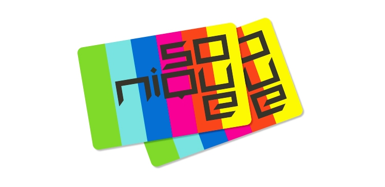
Identity for Sonique:


Gallery exhibition brochures for Vermelho:


Graphic project for the brand Forma, who sell sports clothes, including logo, packaging, labels, tags, prints and catalogue.


Pryor

Pryor Design's logos and stationery work:

I chose to use these as examples for their subtle but clever use of colour and imagery in the logo designs below.


...And this project to show just how bold blocks of colour can completely change the audience its aimed at, the formality and the total look of a logo.


Print Visit


Today Gill from Ghost Communications took me to visit the printers that they use for their work and I was given a personal tour around the place showing what each printer does and everybody's role in the production process. They were very helpful and friendly and there was a real buzz to the place that made it really interesting seeing so much going on. One step closer to being the printer's best friend!