Another example of how colour can make all the difference and completely alter the way you look at a design.
'On its own the typographic system is super simple, but the pop of pink paper really makes it sing.' (DesignWorkLife)
Showing posts with label Brief 4 - Make up Artist (Live Brief). Show all posts
Thursday, 28 October 2010
Wednesday, 27 October 2010
Campo Colour Examples
A Brazilian graphic design company, Campo, produce some interesting printed designs for many companies. Here are some identities which show ways in which I could add colour to my make up artist identity designs and stationery in different ways.
Identity for Vermelho, the São Paulo art gallery including stationery, annual activities report, brochure and personal cards:
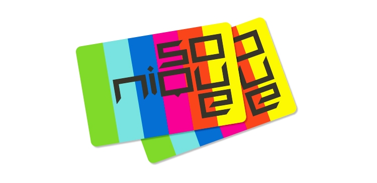
Identity for Sonique:
Identity for Vermelho, the São Paulo art gallery including stationery, annual activities report, brochure and personal cards:
Identity for Sonique:
Gallery exhibition brochures for Vermelho:
Graphic project for the brand Forma, who sell sports clothes, including logo, packaging, labels, tags, prints and catalogue.
Pryor
Pryor Design's logos and stationery work:
I chose to use these as examples for their subtle but clever use of colour and imagery in the logo designs below.
...And this project to show just how bold blocks of colour can completely change the audience its aimed at, the formality and the total look of a logo.
I chose to use these as examples for their subtle but clever use of colour and imagery in the logo designs below.
...And this project to show just how bold blocks of colour can completely change the audience its aimed at, the formality and the total look of a logo.
Sunday, 24 October 2010
Project Projects
Rachel Uffner gallery identity and promotional materials by project projects:
NADA Art Fairs promotion below. Both these projects have a common theme of large type layered over images which is a strong visual idea that I really like for an invitation style layout.
Saturday, 23 October 2010
Mash Creative
These logo identity designs by mash creative are simple and straight to the point. Working with just one element in the logo, joining two letters together or using simple imagery to add a slight detail is something I am going to do to make my designs work.
Tuesday, 19 October 2010
Sunday, 17 October 2010
Invitation Designs
I absolutely love these letterpress designs by Peggy Wong of bluepoolroad designs. The subtle colour and high quality finish is beautiful.
Subscribe to:
Posts (Atom)